Blush Harmony - Floral Wallpaper in Soft Watercolor Shades
Blush Harmony - Floral Wallpaper in Soft Watercolor Shades
from 209 zł/m²
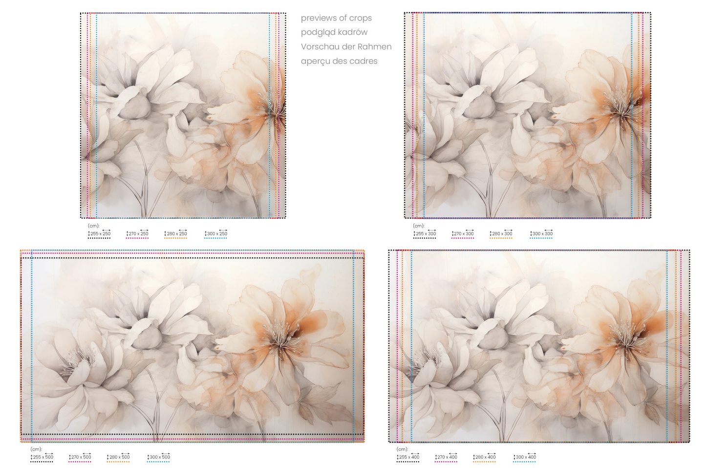
- High-resolution crop for your approval before printing
- Colour guarantee — free replacement for print defects
- Certified Mura materials — safe for children and allergy sufferers
- Full care of your order — installation coordination included
- Free delivery across Europe — in a rigid protective tube
SKU:020#Flower21
Blush Harmony - Romantic Floral Wallpaper
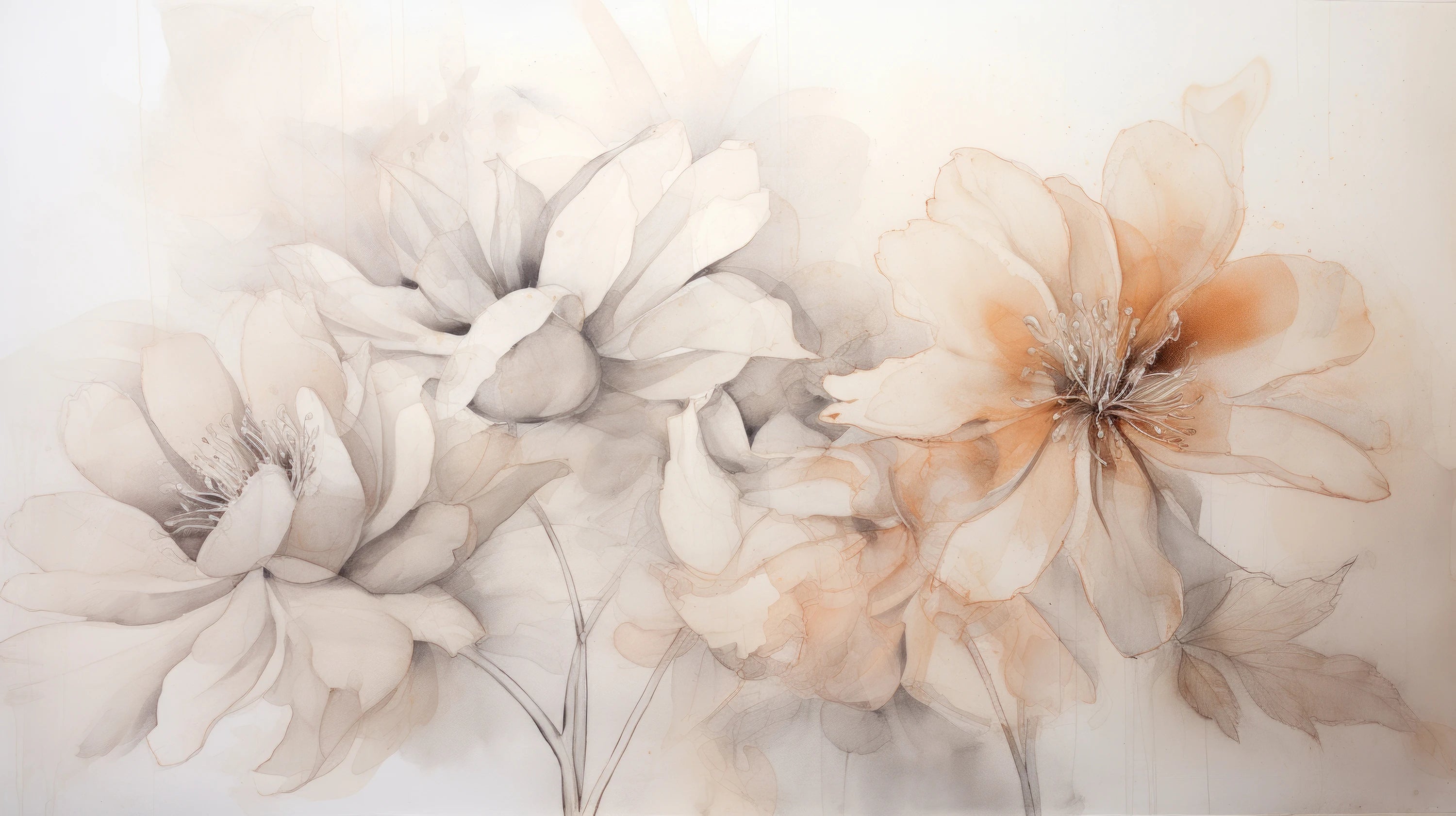
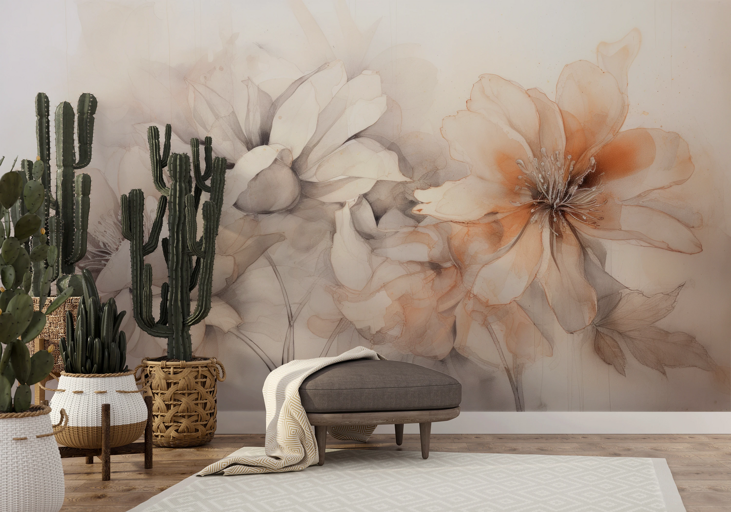
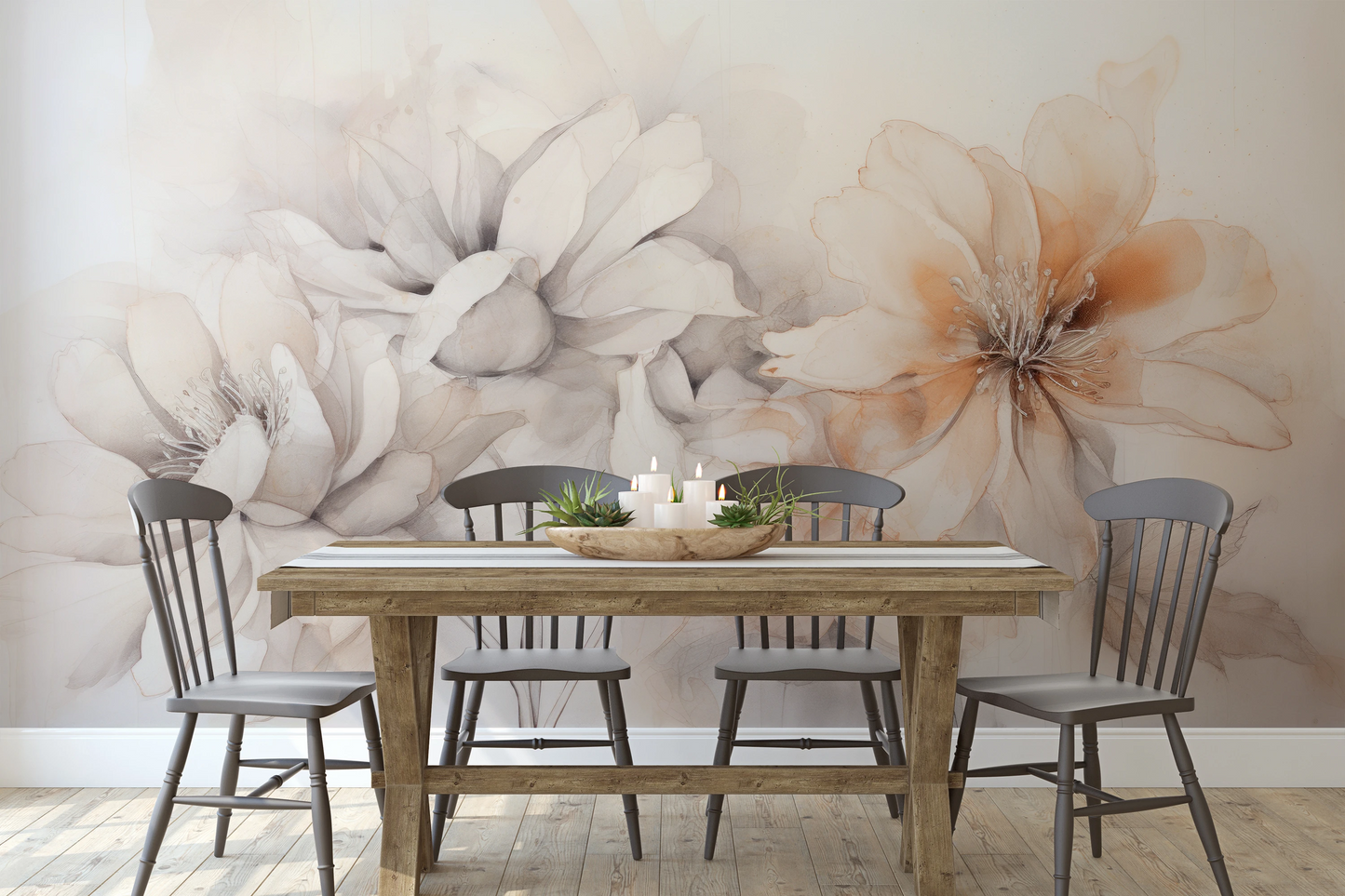
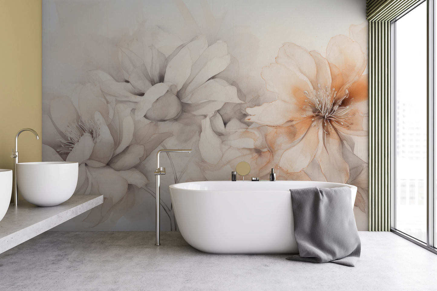
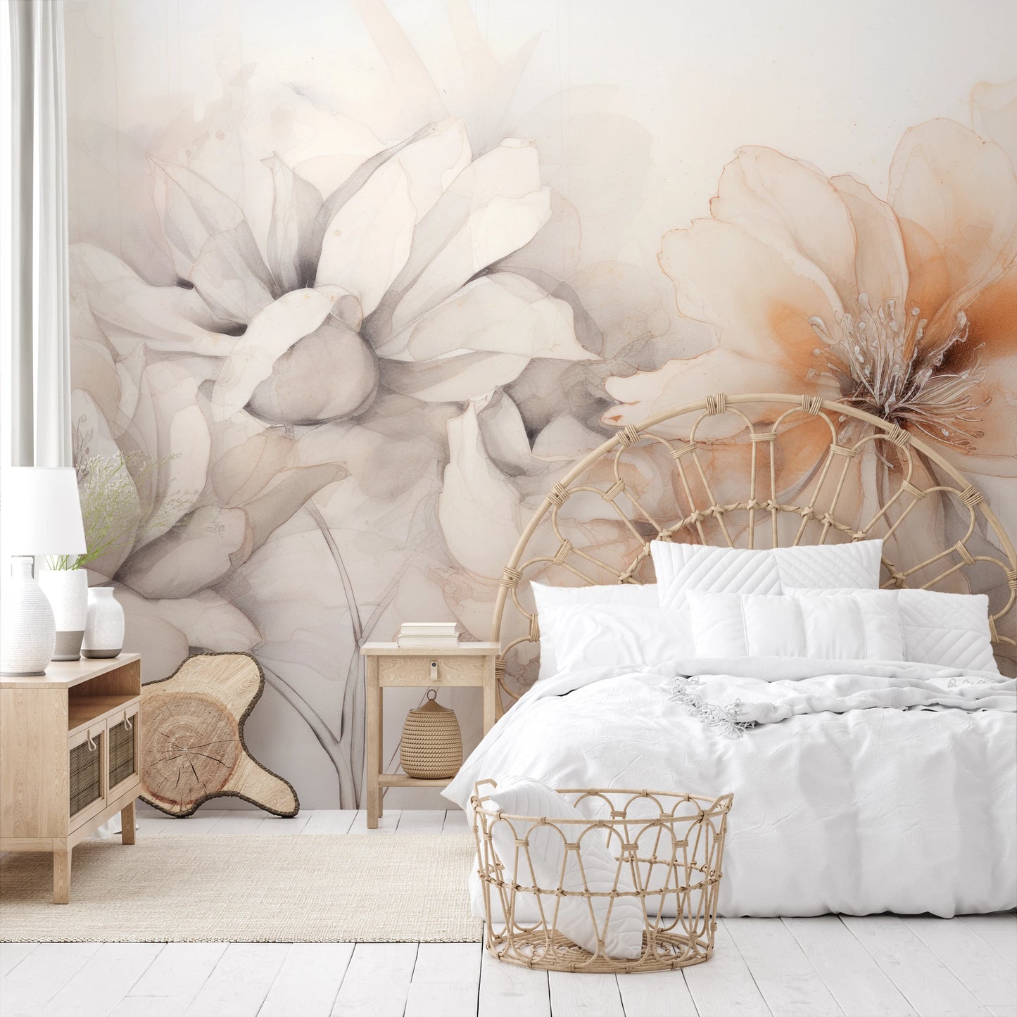
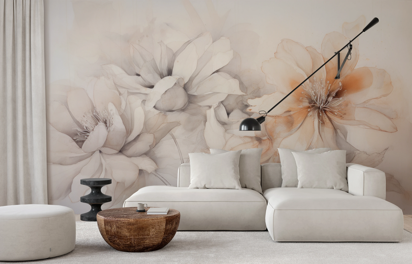
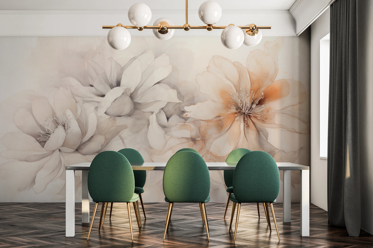
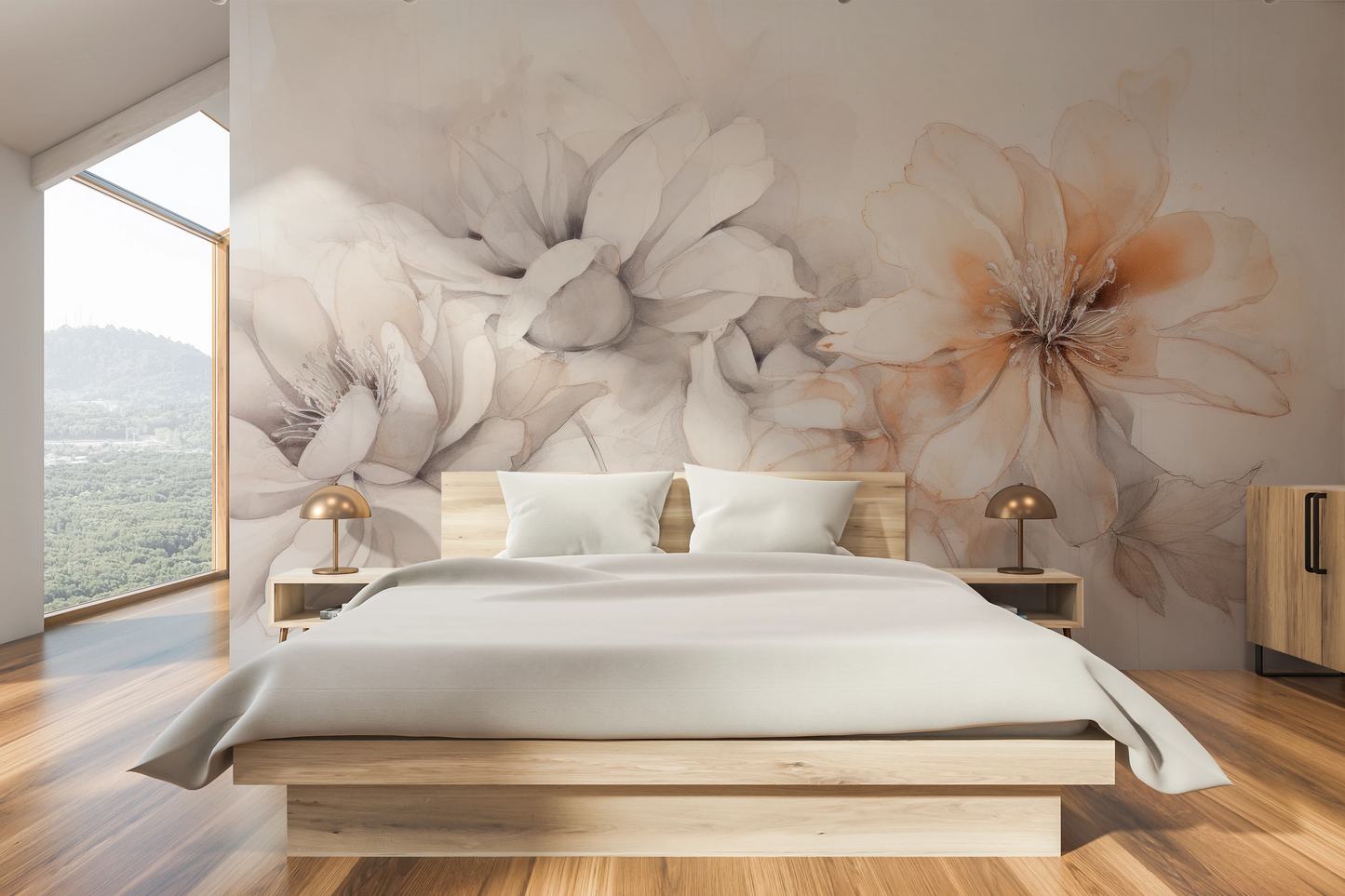
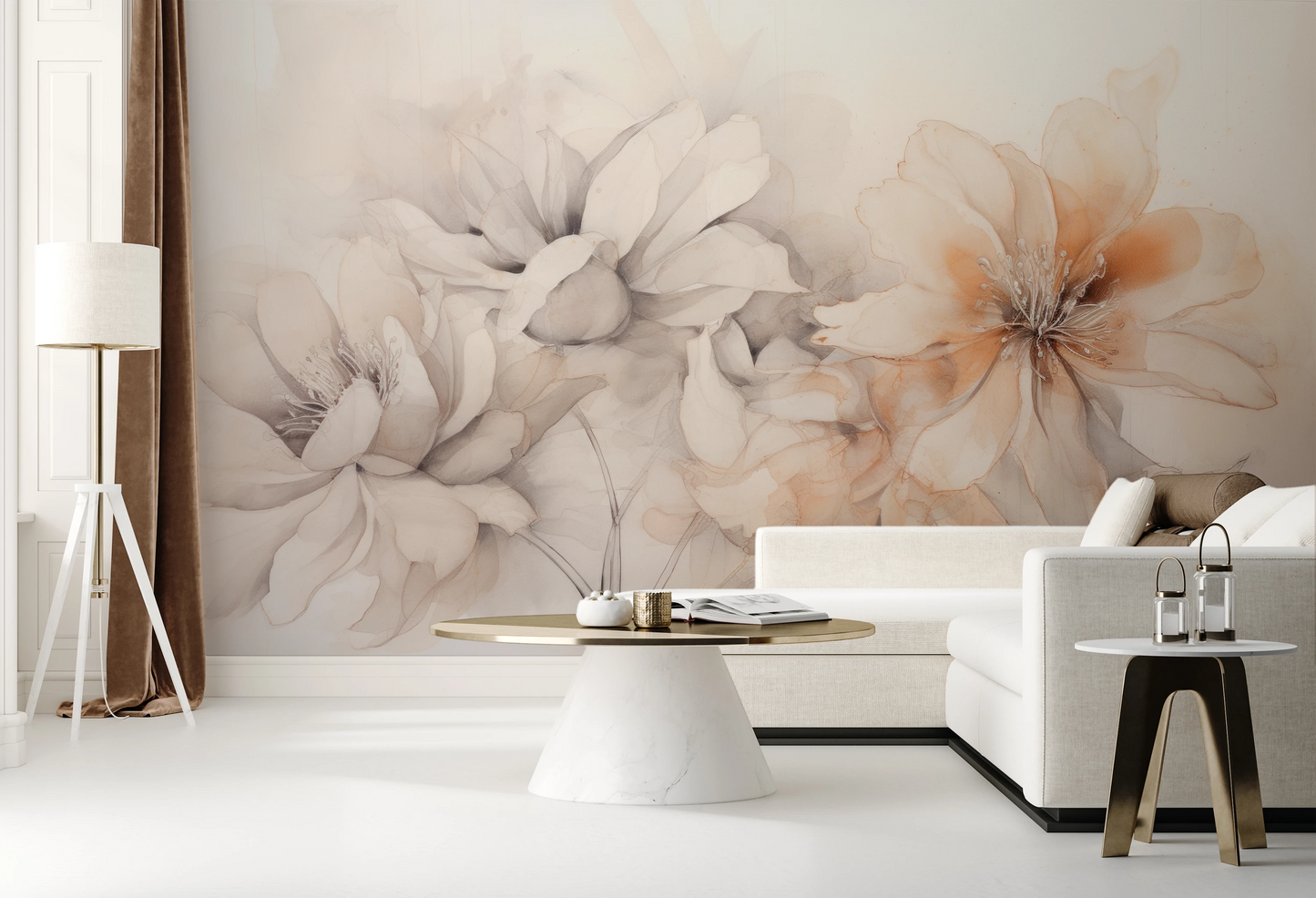
This unique floral wallpaper captivates with its watercolor delicacy and subtle composition. Blush Harmony presents painterly peonies and magnolias in powder pink, peach accents, and milky beiges that intertwine like watercolor on paper. Each petal seems to float in space, creating a composition full of lightness and poetic harmony. Delicate color transitions and transparent layers of flowers give the pattern a three-dimensionality and depth, as if capturing the magic of a fleeting bloom.
This floral wall mural departs from the typical, orderly botanical arrangement. Instead of a symmetrical bouquet, we receive a free, almost impressionistic interpretation of flowers—as if created in the studio of an artist enamored with the subtleties of nature. Powdery pink petals intertwine with peach tones and gray accents, creating a palette worthy of painterly light studies. The milky white background allows the flowers to float in space, giving the composition a sense of peace and harmony.
Why Blush Harmony?
The name Blush Harmony refers to powder rose—the color of blush that permeates the entire composition. "Blush" is the English term for the delicate pink that appears on the cheeks in moments of emotion, and this shade dominates this pattern. Peonies and magnolias spread across the surface in shades of powder pink, from the most delicate, almost transparent shades to more saturated accents of peach and apricot. This floral wallpaper captures the essence of nature's blush—subtle, coy, yet graceful.
The word "Harmony" in Blush Harmony refers to the harmonious arrangement of elements—both color and composition. The flowers don't compete for attention, but coexist in natural balance. Petals intersect and overlap, creating delicate layers of transparency, as if a watercolorist had applied successive glazes of color. Grays and beiges balance the sweetness of the pink, introducing cooler tones that keep the composition from being overly cloying. The effect is reminiscent of morning mist over a garden full of flowering shrubs—soft, calming, and harmonious.
Blush Harmony evokes a sense of quiet joy and romantic dreaminess. This floral wallpaper doesn't shout, but rather whispers about the delicacy and transience of beauty. Perfect for interiors seeking subtlety and poetry – bedrooms seeking a haven of peace, living rooms finished in shabby chic or Provençal styles, or boudoirs evoking classic femininity. This is a proposal for those who value a painterly interpretation of nature over photographic realism.
Application
Blush Harmony finds its most beautiful application in a flower wallpaper for a romantic bedroom . Powdery pinks, peach accents, and milky beiges create a palette conducive to relaxation and rest. The pattern works beautifully behind a bedhead, introducing a painterly decoration that is not overwhelming, but rather calming. The watercolor delicacy of the composition harmonizes with shabby chic, Provençal, or romantic vintage bedroom wallpapers . Pairing it with bedding in shades of white, light linen, or creamy vanilla will enhance the impression of color harmony. If you're looking for a similar softness in a different interpretation, discover the Flowers collection , which offers a variety of approaches to painterly floral motifs.
In the living room, this floral wallpaper creates an elegant focal point. The pattern works perfectly on the wall behind the sofa or in a lounge area, adding a decorative accent that gives the room a feminine, subtle character. The composition complements wallpapers for a romantic living room with light furniture, rattan accessories, and natural accents. Blush Harmony pairs beautifully with light-toned woods—light oak, bleached birch, and natural rattan—creating a warm, cozy atmosphere. If you're fascinated by the combination of painterly flowers with delicate texture, choose the Whispering Leaves collection , where you'll find a similar watercolor approach to plant motifs.
Blush Harmony is also a perfect floral wallpaper for a feminine study or home office with an elegant character. In a workspace, the pattern introduces an element of delicacy and calm that balances the stress of work. The powdery tones aren't distracting, but rather calm the eye during breaks from the monitor. The composition harmonizes perfectly with wallpapers for offices with a modern, feminine character – with light wood desks, gold accents, and minimalist accessories. The pattern also works well as a hallway wallpaper , where it will introduce a welcome, warm feeling from the moment you walk in. If you prefer an even more subdued palette, check out the Backgrounds collection , which offers painterly backgrounds in calmer shades.
In commercial spaces, this floral wall mural will look beautiful in beauty studios, cosmetic salons, boutique wedding studios, or portrait photography studios. The powdery palette and romantic composition create an atmosphere of luxury and femininity, perfect for premium beauty brands. The pattern fits beautifully into the interior design of a Provençal-inspired café or a restaurant with an elegant, feminine décor. If you're looking for more botanical motifs for commercial projects, explore the Leafs collection , which offers a more graphic approach to plant life.
For whom?
Blush Harmony was created for lovers of romantic, feminine interiors with a subtle character. If you value delicacy over contrast, poetry over realism, and color harmony based on palettes inspired by nature, this pattern is for you. It's a proposition for those seeking a painterly interpretation of flowers, not photographic documentation. The pattern will appeal to women who appreciate shabby chic, Provençal, romantic vintage, or contemporary feminine minimalism—those who want their interiors to tell a story of delicacy and grace.
It's also an excellent choice for those designing interiors in the spirit of slow living and mindfulness. The watercolor-like softness of the composition, powdery shades, and transparent layers of flowers create an atmosphere conducive to relaxation and tranquility. If you treat your home as a refuge from the fast-paced world, a place where you want to slow down and unwind, Blush Harmony will create the desired atmosphere. This pattern will work well for those practicing yoga, meditation, or simply cherishing moments with a book and aromatic tea in a peaceful space.
Blush Harmony is also a choice for interior designers specializing in feminine spaces—boudoirs, dressing rooms, master bedrooms, or beauty studios. If you're working on a project for a client who values elegance, delicacy, and artistry over obvious solutions, this pattern will create a unique focal point. This composition is also perfect for commercial projects in the beauty, fashion, or wedding industries—anywhere where sophistication and subtlety are key. This is a proposition for those who understand that true luxury lies in detail and harmony, not in flamboyance.
Arrangements
Blush Harmony looks most beautiful when paired with a palette of light, natural colors. Furniture in shades of white, milky cream, light linen, or bleached wood will be perfect companions. A sofa in a light, vanilla shade or a bed upholstered in light beige velvet will create a harmonious composition with powder pink flowers. Introduce natural materials into the interior—rattan armchairs, wicker baskets, linen textiles—to enhance the natural character of the design and add warmth. Gold or brass accents—lamps, mirror frames, and furniture handles—will add a touch of elegance and luxury.
Textiles are a key element of a Blush Harmony arrangement. Choose curtains in pale pink or natural linen, which will subtly echo the pattern palette. Decorative pillows in powder pink, peach, light gray, and milky white will echo the colors of the arrangement, creating a cohesive whole. A rug in beige or light pink zlage will further tie the flooring to the wall decoration. Avoid patterned fabrics – opt for smooth textures that allow the flowers to dominate the space. Velvet pillows or a velvet bedspread will add a touch of luxury and softness.
Lighting plays a key role in bringing out the beauty of Blush Harmony. Warm, natural light will best accentuate the delicate tonal transitions and watercolor character of the composition. Choose lamps with shades of white, linen, or delicate pink, which will cast a soft, diffused light. Avoid cold, fluorescent lighting, which can flatten the subtlety of the palette. Where possible, maximize daylight—the pattern looks beautiful in rooms with large windows, where natural light highlights the transparency of the petals. In the bedroom, choose adjustable light sources to adjust the ambiance to the time of day and your mood.
Inspirations
Blush Harmony draws inspiration from 19th-century watercolor painting, particularly the work of artists specializing in botanical studies and delicate watercolor flower paintings. The composition evokes the tradition of painting flowers en plein air—in the garden, in natural light, which captures the subtle color transitions and translucency of the petals. The watercolor technique, with its characteristic transparent layers and soft flow of pigment, has been translated here into the contemporary language of interior decoration. The effect is reminiscent of the work of the Impressionists, who captured the fleeting moment and the fleeting beauty of nature.
The pattern also references the culture of camellia and magnolia gardens, particularly popular in the culture of French romantic gardens and English country estates. Peonies and magnolias in shades of pink and peach are flowers with profound symbolism – they represent femininity, delicacy, transient beauty, and humility towards nature. In Japanese culture, a blooming magnolia symbolizes purity and nobility, while in European tradition, it symbolizes love and grace. Blush Harmony brings this symbolism to contemporary interiors, offering not only decoration but also a spiritual message about the values of beauty and harmony.
The composition evokes emotions of quiet joy and reflective daydreaming. Powdery shades and transparent layers of petals create an atmosphere of tranquility and emotional comfort—as if nature were whispering about the need to slow down and appreciate fleeting moments of beauty. This is a design for those who value slow living and mindful interiors—spaces that foster inner harmony and peace. Blush Harmony is a tribute to the subtlety and poetry of nature, translated into the language of contemporary interior design with respect for painterly and botanical traditions.
Premium Materials
Blush Harmony is available in five premium finishes that emphasize the watercolor character of the composition and the subtlety of the tonal transitions. Choosing the right material allows you to customize the design to suit the character and function of the room.
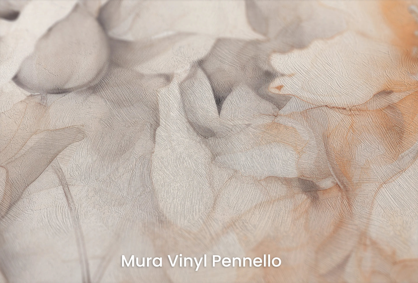
- Mura Vinyl Pennello – a texture reminiscent of an artist's brushstrokes, perfect for Blush Harmony. The subtle texture highlights the painterly nature of the composition and adds depth to the flower petals. This moisture-resistant material is perfect for bedrooms, living rooms, and spaces with high humidity. Easy to clean – simply wipe with a damp cloth.
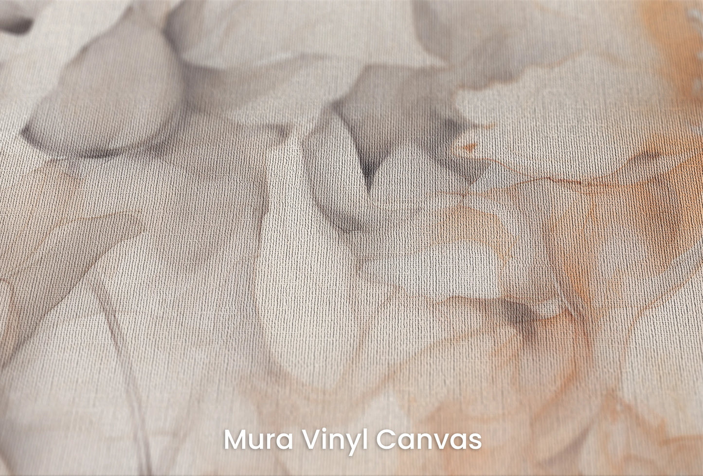
- Mura Vinyl Canvas – a canvas texture that most closely captures the character of a watercolor flower study. This material's subtle grain creates the impression of a composition created on a real artist's canvas. An excellent choice for interiors with a romantic, artistic feel. The canvas texture harmonizes beautifully with natural materials such as wood, linen, and rattan. Durable and resistant to everyday use.
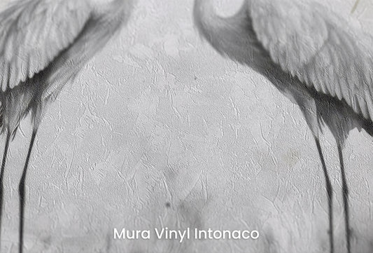
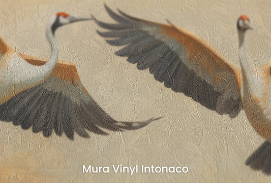
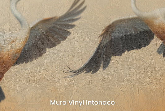
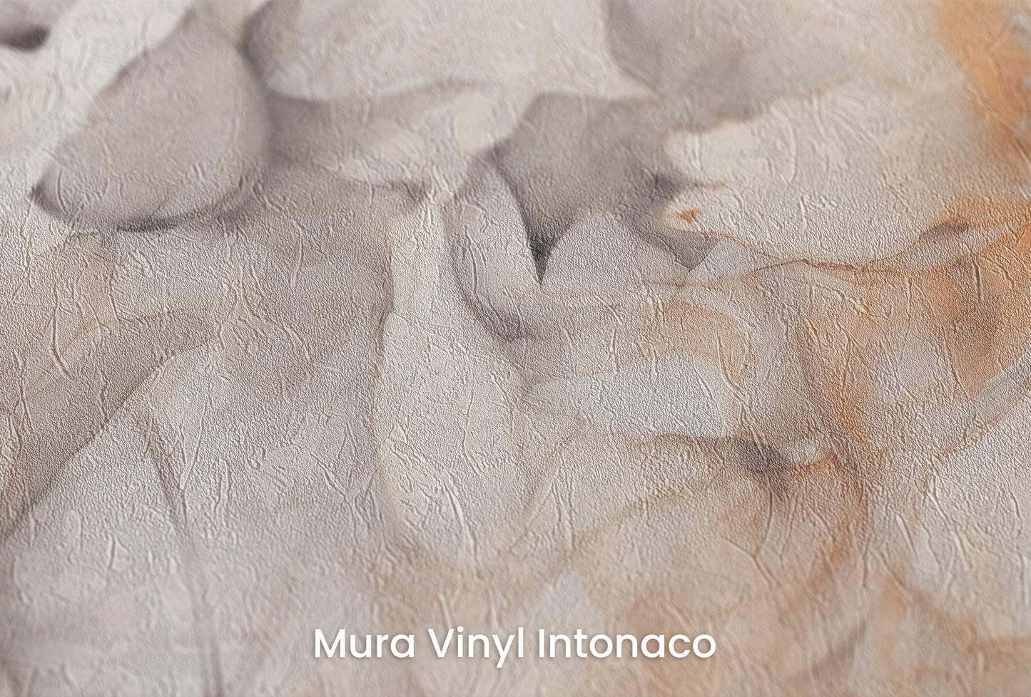
- Mura Vinyl Intonaco – a matte, smooth surface reminiscent of lime plaster, lending the composition a delicate, subdued character. Intonaco is perfect for minimalist interiors with a Provençal or Scandinavian style, where the powdery shades of Blush Harmony will subtly harmonize with the architecture. The lack of gloss eliminates light reflections, allowing the watercolor-like softness of the pattern to be fully appreciated. The material is easy to care for.
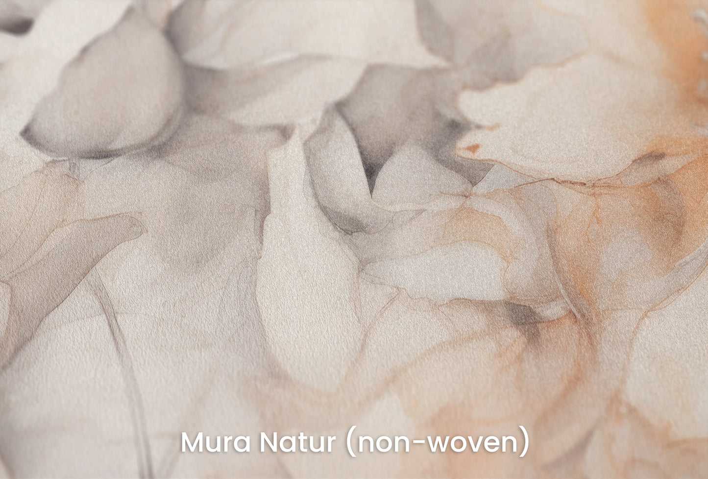
- Mura Natur – an eco-friendly paper fiber that enhances the natural character of floral arrangements. Its texture resembles watercolor art paper with a delicate grain, beautifully enhancing the impression of hand-painted art. This breathable, eco-friendly material is ideal for eco-friendly interiors and slow living. Natur is perfect for bedrooms and relaxation spaces where natural, safe materials are important. Its soft, matte finish avoids reflections.
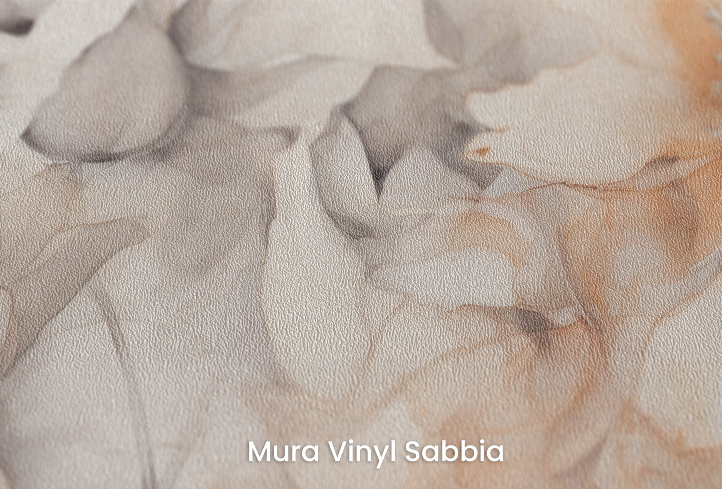
- Mura Vinyl Sabbia – a structure with a subtle sand grain that adds a delicate texture to the composition. Sabbia is perfect for Provençal or rustic interiors, where you want to combine the romantic delicacy of flowers with a more natural, earthy texture. The material is damage-resistant, easy to clean, and suitable for spaces with heavy use. The sandy texture subtly breaks the sweetness of the powdery shades, introducing an element of balance.
Personalization and Visualization
Each project requires a personalized approach, which is why we offer custom production tailored to your needs. Thanks to advanced technology, you can see how Blush Harmony will look in your space before making a decision. Use the free AI visualization tool available directly on the product page—simply upload a photo of the room, and the system will automatically generate a preview of the pattern on your wall. This is a quick way to test whether powdery pinks and painterly magnolias harmonize with your décor.
If you require a more precise visualization or have unusual wall dimensions, take advantage of our professional visualization option. Send us a photo of your interior, and our design team will prepare a realistic installation of the design in your room, taking into account perspective, lighting, and proportions. Before finalizing your order, you can also order a 50x90 cm sample, delivered within 48 hours. This is a perfect opportunity to see the delicate watercolors, color transitions, and texture of your chosen material in person—from canvas to sandy sabbia. Free shipping covers all of Europe, regardless of the size of your order.

Our customers’ reviews
-
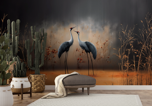
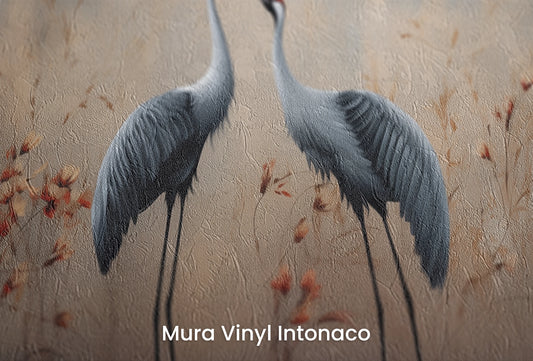
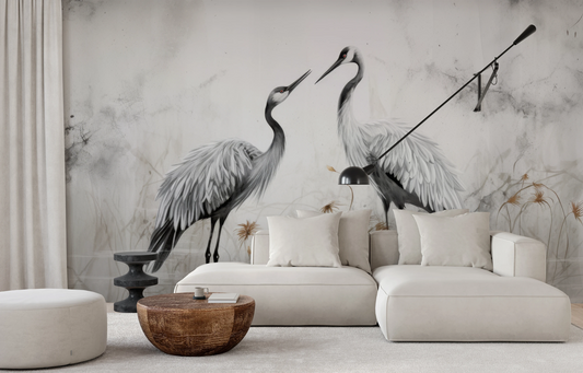
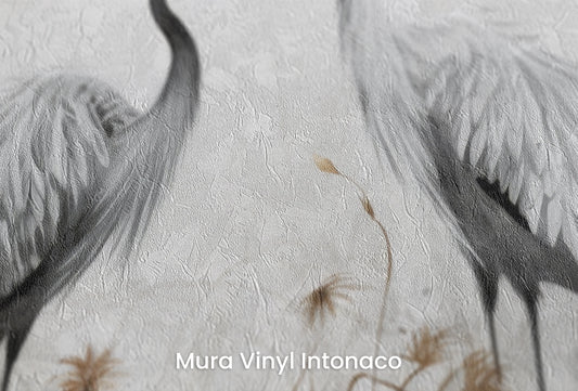
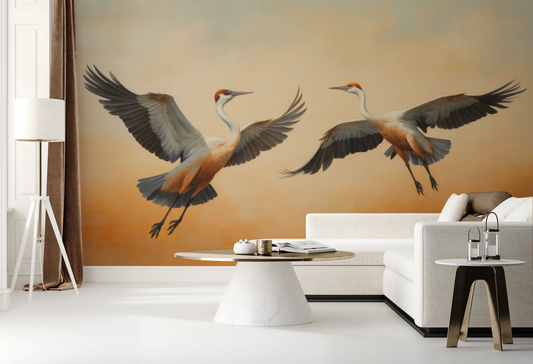
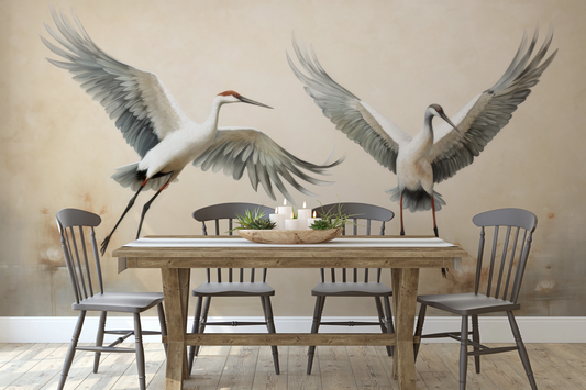
Dancing Cranes
Regular price From 209,00 zł PLNRegular price -
Serenity Waltz - minimalist crane wallpaper in muted watercolor
Regular price From 209,00 zł PLNRegular price -
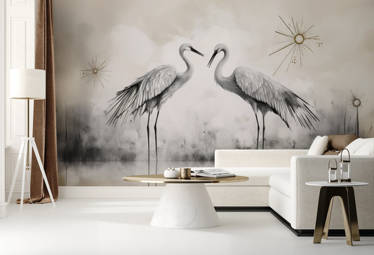
Starry Harmony - Artistic Crane Wallpaper with Gold Accents
Regular price From 209,00 zł PLNRegular price -
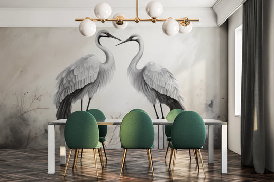
Eternal Bond - elegant crane wallpaper in a subdued gray palette
Regular price From 209,00 zł PLNRegular price -
Golden Duet - elegant crane wallpaper in warm zen colors
Regular price 209,00 zł PLNRegular price -
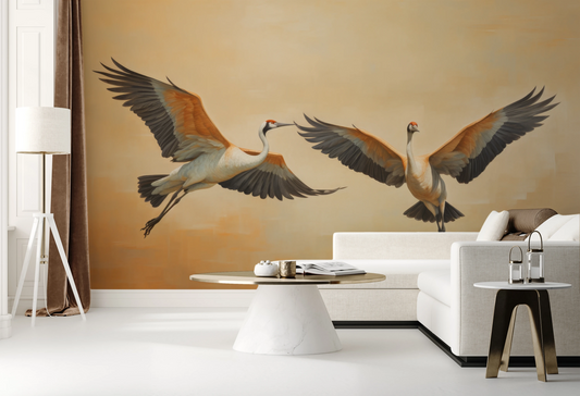
Sunset Soar - majestic wallpaper of cranes in the warm, sunset aura
Regular price 209,00 zł PLNRegular price -
Graceful Leap - elegant wallpaper of flying cranes on a beige background
Regular price 209,00 zł PLNRegular price -
Symphony of Wings - majestic crane wallpaper in Japanese Zen aesthetic
Regular price From 209,00 zł PLNRegular price