Warm Naturals
Beiges
Cool Neutrals
Whites
Green & Nature
Sky & Water
Gold Accents
Minimalist
Modern
Elegant
Scandinavian
Industrial
Artistic
Japandi
Boho
Glamour
RusticLiving Room
Bedroom
Office
Kitchen
Dining Room
Hallway
Bathroom
StudyFlowers
Abstract
Geometry
Landscape
Sea
Marble
Concrete
Forest
Animals
3D
-
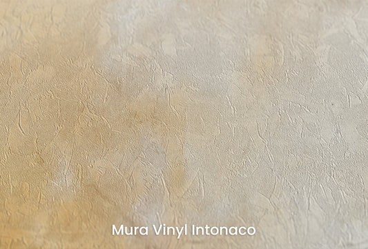
VINTAGE PARCHMENT - abstract wallpaper with a warm parchment texture
Regular price 209,00 zł PLNRegular price -
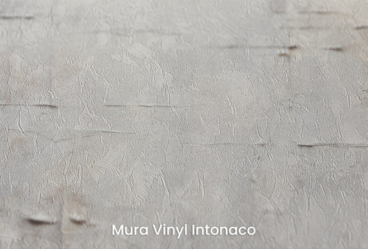
ANCIENT WALLS - Abstract Wallpaper with Old Concrete Texture
Regular price From 209,00 zł PLNRegular price -
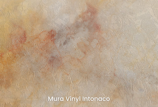
AMBER DREAMSCAPE - Abstract Wallpaper with Warm Oranges and Grays
Regular price From 209,00 zł PLNRegular price -
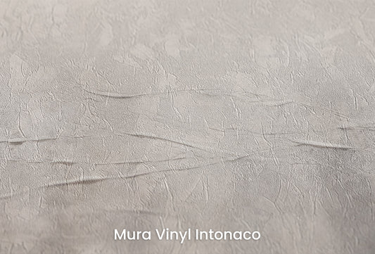
WHISPERING SHADOWS - Abstract wallpaper with misty forms in beige and gray
Regular price From 209,00 zł PLNRegular price -
EARTHEN WARMTH EMBRACE - Abstract wallpaper with warm shades of beige and brown
Regular price From 209,00 zł PLNRegular price -
SOLAR FLARE AURA - Abstract wallpaper with warm shades of orange and brown
Regular price 209,00 zł PLNRegular price -
GALACTIC DUST STORM - abstract photo wallpaper with misty forms in beige and gray
Regular price 209,00 zł PLNRegular price -
CELESTIAL DAWN MURAL - Abstract mural with warm shades of orange and gold
Regular price 209,00 zł PLNRegular price -
AURORA SMOKE CASCADE - Abstract wallpaper with smoky streaks in warm beige and gray tones
Regular price 209,00 zł PLNRegular price -
SMOKE WHIRL ABSTRACT - abstract wall mural with swirling smoke and cool gray tones
Regular price 209,00 zł PLNRegular price -
AMBIENT OCHRE MIST - Abstract Wallpaper with a Warm Ochre and Beige Mist
Regular price From 209,00 zł PLNRegular price -
WINTER'S WHISPER - Abstract Wallpaper with Cool Concrete Texture
Regular price From 209,00 zł PLNRegular price -
GOLDEN HAZE DREAMSCAPE - Abstract wallpaper with a warm orange and beige palette
Regular price 209,00 zł PLNRegular price -
ETHEREAL CARTOGRAPHY - Abstract Wallpaper with Map Texture in Shades of Beige and Gray
Regular price 209,00 zł PLNRegular price -
ARCHAIC MAP OF DREAMS - Abstract wallpaper with a painted parchment texture
Regular price From 209,00 zł PLNRegular price -
ANCIENT SCROLL CANVAS - Abstract Wallpaper with an Old Parchment Effect
Regular price 209,00 zł PLNRegular price